A Book Review from Books At a Glance
by Matthew B. Tabke
The Center for the Study of New Testament Manuscripts was formed in 2002 by Daniel Wallace in Plano, Texas. The Center has a mission of taking digital photographs of every New Testament manuscript housed in various institutions, libraries, museums, and other locations around the world. These photos have been made freely available for public viewing and use on their website. Such an organization is of unprecedented value. Any person with internet access now has at the touch of a keyboard, an ever-increasing number of ancient copies of the Scriptures. Researchers, particularly text critics, will likely make heavy use of the Center for their work, but those with an artistic eye may notice something markedly different from modern Bibles in many of the ancient lectionaries: their stunning artistry.
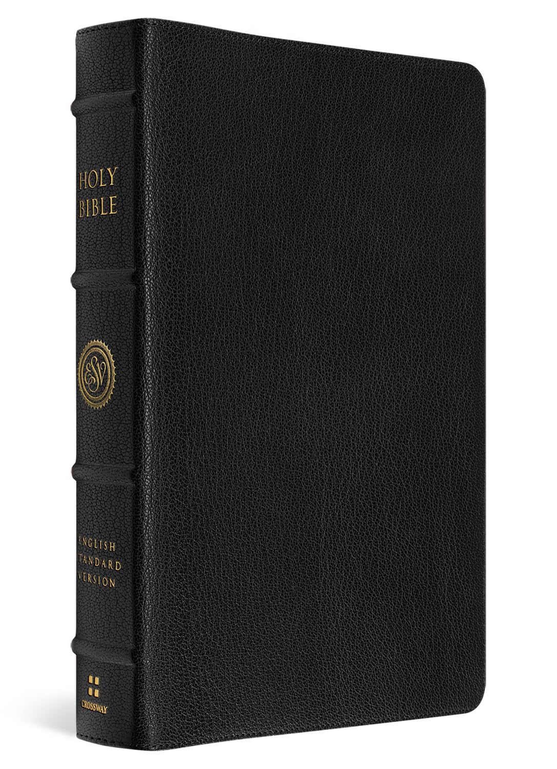
In 2012, Crossway entered the premium Bible market by launching the ESV Heirloom Single Column Legacy Bible. Their Heirloom line has morphed and changed over the years, featuring several Bibles in different sizes and formats. The Bible under review is one such Bible from the Heirloom line that was released last year. The effort by Crossway in the production of this Bible is representative of a long Christian tradition that has crafted a beautiful physical object to house the most precious series of Words ever written. Some may wonder about the purpose of reviewing a Bible. How, after all, can one critically review the Words of God? Yet YouTubers and bloggers receive several Bibles from various publishers each year for review, and there is more to speak about than one might first expect. Add to this that the ESV released an updated translation in 2025, which is contained within the covers of this radiant piece of art. This review, therefore, will speak primarily about the various physical features of the Bible, but also mention some aspects of the translation update and make comments related to the ESV generally.
The first aspect of note is the packaging the Alpha comes in. The Bible arrived in an average packer, but inside was a two-piece box with heavy cardboard. It is clear from the outset that Crossway spared no expense in the development of this item. The box has the title on the front, some information about the Bible on the back, and is stamped on all six sides with an “A” in gold art print. Upon opening the box, one is greeted with a comforting dark purple interior covered in a design of vine-like vegetation, the Bible itself, and a thick paper card describing the Alpha and Crossway’s promise for purchasers. This promise is no small matter. Crossway states on the card, “if you experience any defect in its (the Bible’s) printing or failure in its binding during normal use, we will replace it with a Bible of equal or greater value.” In other words, if one purchases this Bible, they are guaranteed to own a premium Bible for the rest of their life.
The name “Alpha” refers primarily to the size of the Bible. The book is five inches wide, seven inches tall, and a little more than one inch thick. Bibles of this size are often referred to as “personal size Bibles” and such a description fits their name. The smaller size makes the Bible quite light (around 28 ounces) and therefore a relatively easy item to carry from place to place. One may be worried that the smaller size affects the font size, and indeed it does. As such, it is perhaps best that the Alpha finds its way into the hands of readers who are comfortable reading smaller print. The size of this Bible makes it ideal for carrying around, but those who are looking for larger font should consider one of the bigger size Heirloom Bibles.
The typography itself is an 8pt in a font named “Lexicon Enschede” and is set in a double column format. The cross-reference system that appears in many modern Bibles is not contained in any of the Heirloom Bibles, but there are several types of footnotes. There are translation notes that offer alternative translations of words such as the footnote on the word “awe” in Acts 2:43 which gives the alternative “fear.” There are footnotes that offer the literalistic rendering of a Greek word for which an English word was supplied. An example of such a note can be found in Luke 11:37 where the literal Greek translation reads “he,” but the word selected in the main text is “Jesus.” In the Gospels, there are footnotes that identify parallel passages in other Gospels, such as footnote “b” in Mark 16:1 that mentions the parallel passages of Matt 28:1-8, Luke 24:1-10, and John 20:1. Other types of footnotes offer explanations of uncommon words or manuscript variances. For instance, the footnote in Luke 10:8 reads, “Leprosy was a term for several skin diseases; see Leviticus 13.” The footnote on Thaddaeus’s name in Luke 10:3 informs the reader that some manuscripts read “Lebbaeus, or Lebbaeus called Thaddaeus.”
Two types of footnotes are perhaps the most important. First, there are footnotes that mention major manuscript variances. It may be true that what is to be considered a “major” manuscript variance is somewhat subjective, but the ESV’s translation committee has attempted to demonstrate these variances with as little bias as possible. Rather than bothering with any of the highly complex details of various particular manuscripts, they have opted to use the phrase “some manuscripts” to describe variances. For instance, John 16:27 contains a footnote on the word “God” that reads, “Some manuscripts from the Father.” Second, in the New Testament, when explicit quotations of the Old Testament appear, a footnote is made with the reference to the Old Testament text as in the footnote on Romans 9:25. Such footnotes provide just the right amount of information for a reader to make connections between the Old and New Testaments. Unfortunately, unlike the CSB translation which puts all New Testament quotations of Old Testament texts in bold, or the NASB which capitalizes all the same, the Heirloom edition does not provide a visual indication of Old Testament quotations in the New Testament, except by the footnote. In Matthew 5:21-26 for instance, the entire passage appears in a single paragraph with nothing but footnotes to indicate that an Old Testament text is being cited. A reader can easily pass over the footnote and not realize an Old Testament text has been cited. For some, this will be a small grievance and will be seen as a feature that makes the Bible better for reading rather than deep study.
The Alpha is not without any visual indicators though. Chapter numbers are much larger than the rest of the font in the main text and are colored red. Book names with the first verse of every page appear above the text on the outer margins of the page in a slightly larger size font than the main text, also colored red. Red page numbers appear on the inner margin above the text. Most of the text is in paragraph format with decisions about where to break and start a new paragraph having been dictated by the translators. Poetic text is set in a broken style rather than paragraph format as is common in works of poetry and many other Bible translations. Finally, thematic titles are offered at various junctures to indicate a new idea in a larger discourse. The latter observations concerning formatting of the text in paragraph or poetic format and thematic titles are arguably subjective, but nearly all modern English Bibles include these additions to a degree. The major alternative to this form of textual layout is to render the Bible verse-by-verse, with no indications that a new paragraph has started, such as in many NASB’s and most KJV’s. There are uses to both layouts, and even translations that use a verse-by-verse format make some paragraph divisions by bolding new numbers to indicate a new paragraph. Whether the reader realizes it or not, such decisions do impact the way one reads the Word of God. That said, it seems unlikely most ESV readers will be bothered by the translation committee’s decisions on formatting. Those who spend thought on such things and have well developed preferences contrary to the formatting will simply not purchase the Bible.
There are a couple of visual aids present in other types of Bibles that are lacking in the ESV translation. First, the translators have opted not to capitalize personal pronouns referring to God. This detail is specifically mentioned in the preface of the Bible, and three reasons are given for it: (1) there is nothing in the original languages that suggests pronouns referring to God should be capitalized, (2) capitalizing pronouns that refer to God is a recent innovation, and (3) the KJV and other translations from which the ESV stems do not capitalize the pronouns. A reader will have to make a judgment about whether such a decision matters to them. Second, in some translations such as the NASB which sees itself as operative according to the same “formal equivalence” translation philosophy as the ESV, words that are added to the text by the translators are italicized in the printed text. The purpose of this decision appears to be to offer the reader a distinction between words that have been added to the text by the translators and those that appear in the original languages. Again, many readers of the highly popular ESV will be familiar with their translation philosophy and style of printing already. Those who are not, however, will have to make decisions about how they desire the text to be rendered.
The absence of these two visual aids is important for one primary reason: the ESV translation was updated in 2025. This means that there could have been any number of changes to the text and the way it was rendered. The changes made amount to around 68 total word changes in 36 passages affecting 42 verses. The updates to the text are relatively minor, and the list is available from Crossway in a PDF. Still, it appears that the translators remained with the same general principles of translation in the 2025 edition of the text rather than reorienting their textual philosophy by any stretch. In other words, the changes are about minor adjustments that more accurately render in English the meaning of the original languages rather than a philosophical change. In fact, some of the changes are merely adjustments to footnotes as in 1 John 1:1 (which incidentally, capitalizes the use of “word” as a reference to Christ). Those who are interested in viewing the changes to the translation can quickly find them via an internet search.
By way of general assessment of the ESV translation, the ESV is a good translation, though as with all translations, imperfect. There are word choices that are personally unfavorable in certain instances and sometimes misrepresent my own interpretive perspective. To give a more controversial example, use of the English word “equity” in various places (2 Sam 8:15; 1 Chron 8:14; Psa 75:2) carries connotations in our culture that (in my view) can cause political and social uncertainty. Or perhaps, as Zachary Garris has pointed out, the questionable use of “manage” in 1 Timothy 3:4-5 may skew the force of a word historically translated “rule.” Somewhat less controversial personal dissatisfactions with the ESV surface in several linguistically awkward phrases like “reclining at table” (Lk 5:29) and “pure nard, very costly” (Mk 14:3), or the use of less common English words like “leukoderma” (Lev 13:39) and “bier” (Lk 7:14). There are dozens of phrases in the ESV that seem to have bizarre sentence construction which is significant because the NASB is commonly considered the more wooden of the two formal-equivalence-translation-philosophy giants. These grievances aside, the ESV remains what most would consider a faithful translation and should be treated as such.
Readers who are already familiar with the ESV will likely be interested primarily in the publisher and the materials that have gone into the construction of the Alpha. This Bible was produced by Jongbloed in the Netherlands. Jongbloed has over 160 years of experience producing Bibles and produces some of the finest Bibles in the world. They work with Crossway, 316Publishing, Schuyler, Cambridge, Allen, and other organizations that sell high-end Bibles. Jongbloed is known as the best Bible publisher in the world and their craftsmanship is apparent in the Alpha.
This copy of God’s Word is bound in a soft calfskin leather. A purchaser of the ESV Alpha can choose between five leather options that each have their own cover. Two calfskin leather options are available: one called “Grenada” which is the copy under review and is a medium depth brown color, and “Mahogany” which is a dark brown. One black version is available in goatskin leather, and there are two cowhide selections that come in “British Tan” and “Tuscan Green.” All the Alpha Bibles have what’s known as “half-yapp” except for the Grenada. Half-yapp means the leather that is used for the Bible’s cover sticks out slightly to protect the pages of the text block from normal usage so that the pages do not become damaged. The Grenada features what’s known as “full-yapp” and differs from the former in that it completely covers the text block. In other words, enough extra leather is contained in the cover that the leather can completely enclose the text block on all sides. As mentioned, the leather that covers the Bible is very soft. The reason for the lack of stiffness is to allow the Scriptures to lay completely flat on a table while reading. This is true not just of the middle of the Bible, but from page one. Such a feature is a highly desirable quality for undistracted reading.
Several other features are worthy of note. First, the Alpha has a golden-red gilt that shines luminously and changes slightly depending on the angle from which one looks at the text block. Second, the ribbons are a major improvement over previous editions of the Heirloom Bible. The Alpha has three brown ribbons that are much thicker and sturdier than the old ribbons in their Heirloom Bibles. Third, the Bible has four raised spine hubs, indicative of an older style leatherbound book. These spine-hubs are a personal favorite and add significantly to the look and feel of the Alpha. Finally, Jongbloed is known for making very thin Bible paper. The paper used in the Alpha is a high quality 28 GSM (grams per square meter) paper. The paper thickness may be a positive or negative depending on the purchaser. The thin paper may be a bit too thin for some, susceptible to tearing, and inadequate for taking notes. Others who refrain from writing in their Bibles may not find the paper to be an issue. At any rate, the paper is fairly opaque and does not allow for much bleed-through while reading.
The ESV Alpha is priced at $299.99 on Crossway’s website. Some who read such a price may ask why the cost of a Bible is so steep. Indeed, perhaps other questions may arise like, “what is the point of all this specialization?” and “aren’t the words of the Scriptures more important than the way they are packaged?” It is true that this copy of the Scriptures is expensive, but at this point, there are three things modern Bible purchasers should consider.
First, the Scriptures contain the most valuable thing God has given us – His very Words. We ought to remember when the Israelites constructed the Tabernacle, the Israelites willingly gave in abundance because obediently building the Tabernacle meant the Living God would walk among them and be their God (Ex 36:1-7). If the Word of God is the most precious thing human beings have, why not make a physical object to house God’s very Words that reflects the preciousness of those Words? Particularly since there are so many cheap copies of the Scriptures that spending our resources on beautiful copies is no reason to fret.
Second, at the beginning of Luke’s Gospel, the work is dedicated to Theophilus (Lk 1:3). Many scholars believe Luke was commissioned by Theophilus to write the Gospel and that Theophilus funded the endeavor. Estimates vary, but the cost could have been more than $2000 (in modern currency) for a single copy of the Gospel of Luke. We live in an age where it is nearly impossible to find a modern translation of the Bible that costs more than $500. From this vantage point a critique of the price makes little historical sense. The Scriptures are so widely disseminated in the modern era that they can be found for free on numerous websites and apps, and physical copies are given away by most Evangelical churches. A high price does not somehow make the ESV unobtainable. This Bible is not meant to be a free Bible given to someone who desperately needs the Word, but an heirloom that can be cherished for generations.
Third, God is beautiful, made a beautiful reality, and made us to image Him by creating beautiful things. In this regard, it may be good for the reader to return to the first paragraph and seek out some of the exquisite hand-made manuscripts that are housed in the world’s museums and institutions. When men copied the Bible in the past, they did not merely write the words in a pragmatic way with as much speed as they could. The whole process of copying the Scriptures was long, arduous, and meticulous. Indeed, it took a man decades to prepare his hands to have the proper muscle memory required for copying Scripture. Even after the invention of the printing press, the Gutenberg Bible or the first King James version are not merely functional, but a representation of hours of human skill funneled into a physical object that the craftsmen knew would never compare to the value of the contents.
It is not wrong to make beautiful things, and beautiful things, even beautiful things made by pagans, reflect God’s image upon the earth. The modern Western world makes objectively ugly things all too often, simply because they are easy and practical. Perhaps a beautiful copy of God’s Word such as the Alpha can aid in restoring a more accurate theological perspective about human manipulation of inanimate material.
Matthew B. Tabke
Buy the books
ESV HEIRLOOM BIBLE, ALPHA: PERSONAL SIZE EDITION